
Automation How-Tos
How to Automate Reporting & Dashboards
The short answer: To automate reporting and dashboards, connect your data sources to a dashboard tool such as Google Looker Studio or Databox instead of exporting spreadsheets by hand. Transform the raw data into clean, agreed metrics once, build charts that answer specific questions, and set the data to refresh on a schedule. Then have the tool deliver the report automatically — a scheduled email, a PDF, or a message in Slack — so the right people see current numbers without anyone rebuilding anything.
Most reporting still happens the slow way: someone exports a CSV from each tool, pastes it into a master spreadsheet, fixes the formatting, updates a few formulas, screenshots the charts, and emails them round. It works, but it eats hours every week, and by the time the report lands it is already a little out of date. Worse, when two people build the “same” report from their own exports, the numbers rarely match.
Automated reporting removes the manual middle. You connect your data sources to a dashboard tool once, define your metrics once, and let the software keep everything current and deliver it on a schedule. This guide walks through that pipeline stage by stage, using tools you can start with for free, so you can retire the copy-paste routine without becoming a data engineer.
Before you start
Take stock of two things: where your numbers currently live, and who actually reads your reports. List every source you pull from — website analytics, ad platforms, a CRM, a payments tool, a database, or a plain Google Sheet someone maintains by hand. Then note who the report is for and what decision it helps them make. A dashboard built for a specific audience and a specific question is far more useful than a generic one that tries to show everything.
You do not need to change any of your tools yet. The goal at this stage is just a clear picture of your inputs and your audience, because that determines which dashboard tool fits and how much transformation you will need in the middle.
Step 1: Decide what the report needs to answer
It is tempting to open a dashboard tool and start dragging charts around. Resist that. Automation only pays off if the report is worth automating, so begin with the questions it must answer, not the visuals.
Write down three to five questions in plain language. For a marketing report that might be: how much traffic did we get, where did it come from, and how much did we spend to acquire a customer. For a sales report: how many deals closed, what is in the pipeline, and are we on track for the target. Each question maps to one or two metrics, and each metric becomes a chart. Anything that does not answer a question your reader has is decoration, and decoration is what turns a clean dashboard into an unreadable one.
Step 2: Connect your data sources
This is the step that removes the manual export. Instead of downloading a file from each tool, you connect each source directly to your dashboard, and the tool pulls the data itself.
There are two common ways to do it. The first is native connectors: most dashboard tools ship with ready-made links to popular services. Looker Studio connects directly to Google Analytics, Google Ads, BigQuery and Sheets, and Databox advertises connections to well over a hundred cloud tools, spreadsheets and databases. If your source is on the list, connecting it is usually a matter of signing in and authorising access.
The second is an automation layer for anything without a native connector. Tools like Zapier and Make can catch data from one app and push it into a Google Sheet or a database that your dashboard then reads. This is how you get a niche tool, a webhook, or a custom system into a report without custom code. If you are new to connecting apps this way, our guide on how to automate repetitive tasks covers the trigger-and-action thinking behind it.
Step 3: Transform and model the data
Raw data from different tools rarely lines up. One source calls it “revenue”, another “total_sales”; dates come in three formats; one platform counts a click the other counts a session. If you skip straight to charts, every report ends up with its own quiet interpretation of the numbers. The transform layer is where you fix that once.
Transformation covers a few jobs: cleaning (removing duplicates, fixing formats, handling blanks), renaming (so “total_sales” and “revenue” become one agreed field), joining (combining sources, such as matching ad spend to the campaigns it funded), and calculating (deriving metrics like cost per acquisition or month-on-month growth). Do this in a defined place — a modelling layer in your dashboard tool, a tidy Google Sheet, or a database view — so every chart draws from the same trusted version.
The payoff is consistency. When your dashboard and your colleague’s dashboard both read from the same modelled metric, they cannot disagree. That single source of truth is often the real reason to automate reporting, quite apart from the time saved. The same discipline underpins good accounting automation, where one clean set of figures has to feed several different reports.
Step 4: Build the auto-refreshing dashboard
Now you assemble the charts. Take each question from Step 1 and give it the simplest visual that answers it: a single big number for a headline metric, a line for a trend over time, a bar for a comparison, a table for detail. Group related charts together and put the most important one at the top, because most people read the first screen and skim the rest.
The part that makes it automated is the refresh. Every dashboard tool lets you set how often it re-pulls its data — Looker Studio and Databox both refresh on a schedule so the dashboard is current whenever someone opens the link. Set a cadence that matches the decision: daily for an operations board, weekly for a marketing review, monthly for a board report. Refreshing far more often than you actually act on the numbers just adds load and, on some connectors, cost, without changing a single decision.
Step 5: Schedule delivery
A live dashboard is only useful if people look at it, and most people will not remember to. Scheduled delivery closes that gap by pushing the report to them instead of waiting for them to pull it.
The options are straightforward. Most tools can email a dashboard or a PDF snapshot on a recurring schedule — Looker Studio, for example, can send a report by email daily, weekly or monthly. For teams that live in chat, Zapier or Make can post a summary or a link into Slack or Teams on a timer. The right choice is simply wherever your readers already are: a weekly PDF for an executive who lives in email, a Monday-morning Slack post for a team that does not.
Keep the delivered version focused. A scheduled email should surface the headline numbers and link to the full dashboard for anyone who wants to dig in, rather than trying to cram every chart into an attachment. The aim is a nudge that gets read, not a report that gets archived unopened.
Step 6: Monitor and maintain the pipeline
An automated report is not set-and-forget; it is set-and-check. The connections behind it depend on things outside your control — an expired login, a renamed column, a platform changing its API, a colleague restructuring the source spreadsheet. Any of these can quietly break a dashboard or, worse, leave it showing wrong numbers while looking perfectly fine.
- Watch for broken connections. Most tools flag a failed data pull; turn those alerts on so you hear about a break before your readers do.
- Guard your definitions. When someone changes how a metric is calculated, update it in the one modelling layer, not in five separate charts.
- Sense-check the numbers. Glance at the report against reality now and then. A figure that looks impossibly good or bad is usually a pipeline fault, not a business miracle.
- Retire what nobody reads. Dashboards accumulate. Every few months, remove the charts and scheduled emails no one acts on.
Common pitfalls to avoid
A few mistakes turn up again and again when people first automate their reporting. Knowing them in advance saves a lot of backtracking.
- Automating a bad report. If the manual version answers the wrong questions, automating it just delivers the wrong answers faster. Fix the report’s purpose first, then automate.
- No single source of truth. Letting each chart define its own version of a metric reintroduces exactly the disagreement you were trying to remove. Model metrics once, in one place.
- Over-refreshing. Pulling data every few minutes for a report you read weekly wastes resources and, on some plans, runs up connector costs for no benefit. Match the refresh to the decision.
- Dashboard sprawl. Adding a chart every time someone asks a one-off question leaves you with a cluttered board no one trusts. Be as willing to remove charts as to add them.
- Ignoring cost creep. Free tiers are generous, but data-source limits and per-user or per-project fees add up as you scale. Check what a tool charges before you build your whole company’s reporting on it.
Putting it together
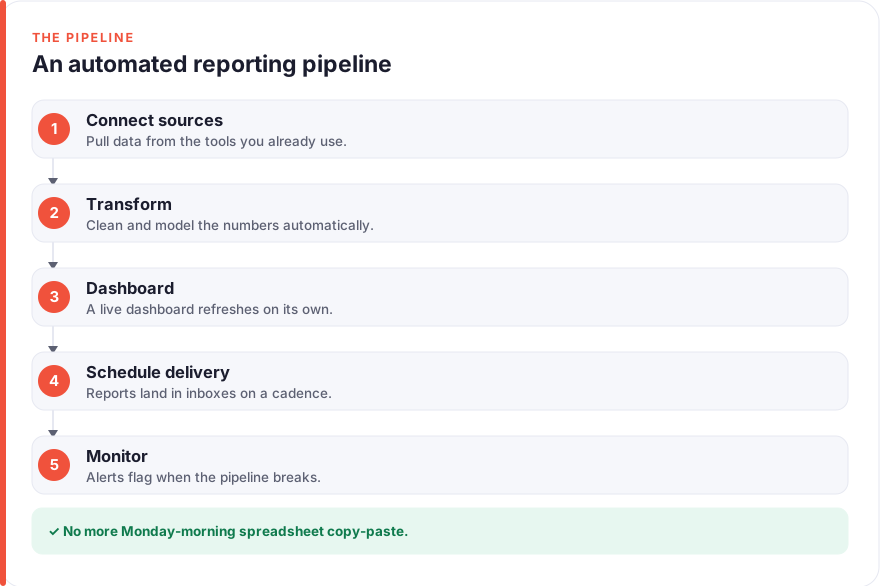
Automated reporting reads as one clean flow: your data sources connect straight into a dashboard tool, a transform layer turns the raw numbers into agreed metrics, an auto-refreshing dashboard answers a handful of specific questions, and a scheduler delivers it to the people who need it — all monitored so the numbers stay honest. No exports, no pasting, no two versions of the truth.
You can start almost entirely for free. Looker Studio is free to use, Google Sheets is free with a personal Google account, and both Zapier and Make have free tiers that cover a first pipeline. Build one connected, refreshing chart, confirm you trust it, and grow from there — one reliable metric at a time beats a sprawling dashboard you are not sure you believe.
FAQ
What is the easiest way to automate reporting?
The easiest starting point is a free dashboard tool with native connectors, such as Google Looker Studio, connected directly to the sources you already use. You link each data source once, lay out a few charts that answer specific questions, and set the data to refresh on a schedule. That alone replaces the weekly export-and-paste routine. As your needs grow, you can add a transformation layer and an automation tool like Zapier or Make to bring in sources without a native connector.
How much do reporting and dashboard tools cost?
Roughly, as of July 2026 — always check the vendor’s pricing page, since these change. Google Looker Studio is free to use, with Looker Studio Pro at about $9 per user per month for added collaboration and support features. Databox offers a free plan and a paid Analyst tier at roughly $64 a month billed annually. For the automation layer, Zapier is free up to 100 tasks a month and around $19.99 a month for its entry paid plan, while Make starts free and its Core plan is roughly $9 a month. Google Sheets is free with a personal account, and a business Google Workspace plan starts at roughly $6 per user per month.
Do I need to know how to code to automate dashboards?
No. Tools like Looker Studio and Databox are built for non-technical users, with drag-and-drop charts and point-and-click connectors. Automation platforms such as Zapier and Make handle the plumbing between apps without code, using visual “when this happens, do that” builders. You may eventually want light spreadsheet formulas or a simple database view for heavier transformation, but you can build a genuinely useful automated report without writing any code at all.
How often should a dashboard refresh?
Match the refresh rate to how often you actually act on the numbers, not to how often the tool allows. A live operations dashboard might refresh hourly or daily; a marketing review is usually fine weekly; a board report often only needs monthly figures. Refreshing far more frequently than you make decisions adds load and, on some connectors, cost, without improving a single decision. Pick the slowest cadence that still gives your readers current-enough numbers.
How do I make sure everyone sees the same numbers?
Define each metric once, in a single transformation or modelling layer, and have every chart and report read from that. Most reporting disagreements come from people building the “same” metric from their own exports with slightly different rules. When your dashboard, your scheduled email and your colleague’s copy all draw from one agreed definition, they cannot contradict each other. That single source of truth is often the biggest benefit of automating reporting, ahead of the time it saves.
Can I get reports delivered automatically instead of logging in?
Yes, and it is usually worth doing, because most people will not remember to open a dashboard on their own. Looker Studio can email a report or PDF on a daily, weekly or monthly schedule, and Databox offers scheduled snapshots too. For teams in chat, Zapier or Make can post a summary or link into Slack or Teams on a timer. Deliver a focused version with the headline numbers and a link to the full dashboard, so the report gets read rather than archived.